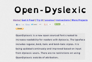
A US-based mobile app designer has created a font with a heavier bottom to give letters 'gravity' and prevent them from flipping and swapping around in the minds of dyslexic readers.The font 'OpenDyslexic' created by a New Hampshire-based designer makes it less likely that the brain will rotate them and confuse sufferers, the BBC News reported.
"Your brain can sometimes do funny things to letters.
OpenDyslexic tries to help prevent some of these things from happening," said Abelardo Gonzalez.
"Letters have heavy weighted bottoms to add a kind of 'gravity' to each letter, helping to keep your brain from rotating them around in ways that can make them look like other letters," Gonzalez said.
"Consistently weighted bottoms can also help reinforce the line of text. The unique shapes of each letter can help prevent flipping and swapping," Gonzalez added.
The 28-year-old had also released OpenWeb a free web browser based on the font earlier this year.
No comments:
Post a Comment